Analysis · 1970
Form follows function: graphic design in the 1970s
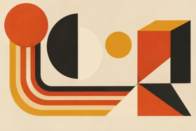
An analysis of how the discipline shifted from ornamental to functional, redefining the brand-consumer relationship through visual message encoding.
Open storyPosters, packaging, typefaces and interfaces make the choices of an era visible. We explore what these pieces set out to communicate, and how they organize information or suggest ways to use objects.
Readings to help you find your bearings.
An analysis of how the discipline shifted from ornamental to functional, redefining the brand-consumer relationship through visual message encoding.
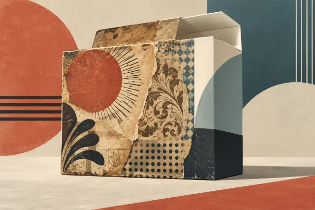
Open storyNeo-retro design combines graphic codes from different periods to give contemporary packaging an impression of craft and authenticity. A study of package design identifies the devices behind that effect and explores the associations they evoke—without treating them as proof of a brand’s history or how its products are made.
Open storyRough textures, mixed typefaces and ornament can make a contemporary product look rooted in the past. A study of coffee packaging identifies these devices and the associations they evoke, while distinguishing visual impressions from a brand’s actual history.
Open storyDesign organizes information and proposes ways to use objects. Comparing different pieces helps distinguish choices made for a practical function from choices that are simply aesthetic labels.
The focus here is visual language as it appears in objects and interfaces. Decoration explores spaces; Software, by contrast, looks at digital tools for creating.
Three perspectives on the archive.
Posters and visual composition: choices that organize an image and guide the reading of its message.
Form follows function: graphic design in the 1970s Form as Function: Graphic Design in the 1970s Advertising TransitionTypefaces and visual identities, and the choices that help them be recognized and communicate.
Neo-Retro Packaging: Signs of the Past, Brands of the Present The Visual Architecture of Brand LaunchesPackaging, interfaces and design choices that guide how each object is used.
Neo-Retro Packaging and the Visual Language of the Past Neo-retro packaging turns the past into a promiseA familiar silhouette can evoke another era without turning a new object into a historical one. A careful reading of retro design compares form, materials and function while considering the contexts that give each design meaning.
Read articleA source identifies Goya’s painting, also called *The Picnic*, as a work from 1776 and says it was inspired by a play of the same name. The scene documents an artistic depiction of a merienda, not everyday practice in itself.
Read articlePeugeot’s activity began in 1810 as a workshop making mills and other household goods, before its later move into bicycles and automobiles.
Read articleThe Spanish peineta was introduced in Buenos Aires around 1815 and became a precursor to the Río de la Plata peinetón.
Read articleThe Prado Museum was founded as the Royal Museum of Paintings; the history of its restoration workshops is studied from that year through archival documentation.
Read articleThe documented period of use of the peinetón, a monumental hair ornament, among women in Buenos Aires begins, extending until 1837.
Read articleA familiar silhouette can evoke another era without turning a new object into a historical one. A careful reading of retro design compares form, materials and function while considering the contexts that give each design meaning.
Heisei retro brings together objects and practices from Japan between 1989 and 2019, but it belongs not only to those who lived through the era. Tamagotchi, stickers, purikura, anime and music show how a reissue can revive not just a design, but ways of playing, making and sharing.
The playing time on each side of a record shaped what could be recorded, how music was released and how listeners used their players. From shellac 78s to Columbia’s microgroove LP and RCA Victor’s 45-rpm single, changing formats altered musical publishing and home listening without dictating a single idea of what an album should be.
The Famicom and NES noise channel handled both gameplay effects and percussion. Joseph Chang’s study of ten soundtracks from 1983 to 1987 shows how different composers turned its limited resources into distinctive musical voices.
In Pong, two rotary controls and a shared cabinet made the duel easy to see—and gave people waiting for a turn a reason to watch. The game’s path from a prototype tested in a Sunnyvale bar to home versions shows how controls and setting could reshape the experience even when the basic mechanics remained familiar.
On her 2008 debut, Lady Gaga connected 1970s glam rock and 1980s electronic pop through danceable songs, deliberate visual theatricality and a participatory idea of fame. The Fame did not reconstruct the past; it adapted it to an increasingly media-driven pop culture.
The microgroove LP did more than fit more music on each side: it helped establish the album, coexisted with the 45 rpm single and reshaped everyday playback. Its history connects engineering, commercial formats and the practices that kept vinyl in circulation after the CD’s rise.
Tamagotchi, Tamamori stickers and purikura show that revisiting the past involves more than reissuing its imagery: it also means considering what people did with these objects and how they circulate today. Heisei retro brings together memory and first-time discovery without reducing the era to a single experience.
Photographs, catalogues and objects can help explain how a home was arranged, but none reveals everyday life on its own. Reading their contexts, materials and traces of use allows for more grounded interpretations without confusing documentation with display.
With her 2008 debut, Lady Gaga made music, theatricality and public image parts of a single proposition. The album turned fame—its allure and its emptiness—into both subject and form, reaching an audience in a decade of accelerating digital circulation.
When objects and practices are still changing, preservation means more than storage. Documenting context, making conservation decisions visible and distinguishing historical sources from later reinterpretations can show how material culture evolves.
Drawings, story sketches, concept art, and background paintings are not incomplete versions of a film: each belongs to a different stage and answers a different question. Read alongside sequences and finished shots, they reveal decisions about staging, style, and collaboration.
Editorial review ·