A contemporary style built from quotations
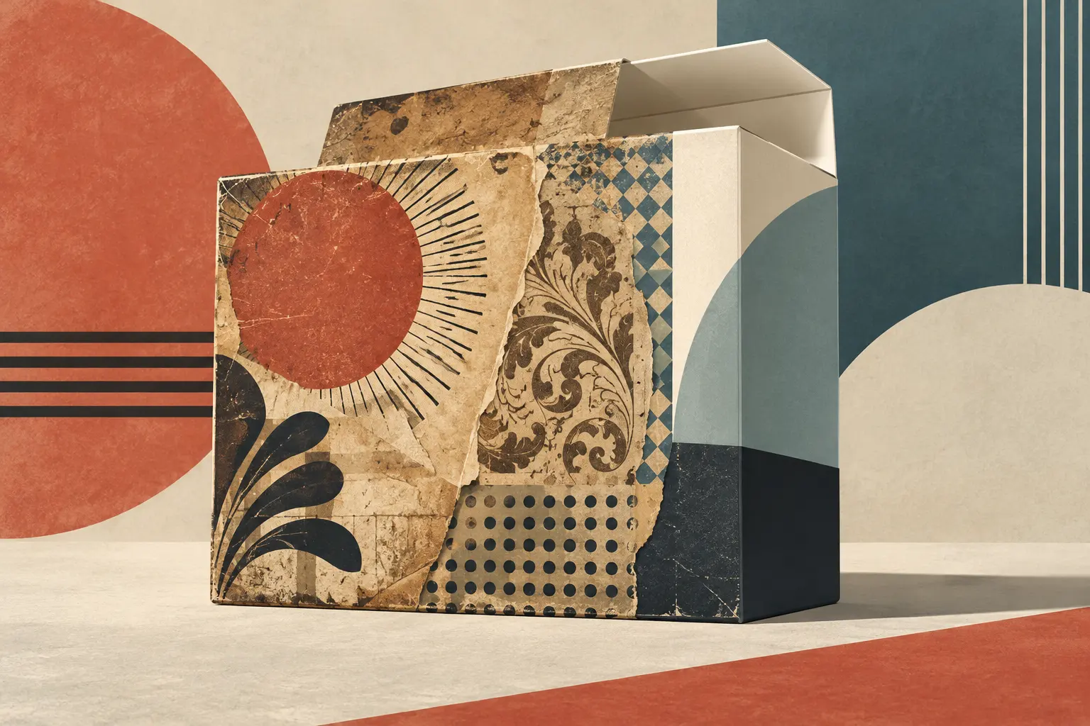
Neo-retro design does not faithfully reconstruct a particular historical style. It takes graphic devices from different periods and combines them in a contemporary aesthetic. On packaging, this may mean matte or rough paper, muted colours, illustrations reminiscent of engravings, decorative lettering and centred layouts. Together, these features suggest age and craftsmanship even when the product and brand are recent.
The distinction between appearance and history is fundamental. In their study of package design, Franck Celhay, Lise Magnier and Jan Schoormans use neo-retro to describe a way of quoting the past that does not necessarily rest on genuine brand heritage. It differs from reviving a company’s own historical design: a new brand can adopt the same visual codes.
Materials, graphics and words
The authors group the style’s elements into three categories: structural, graphic and informational. Structural features include materials that look natural or aged, such as uncoated paper and cardboard, textured surfaces, glass and visible irregularities. Graphic devices include limited, low-saturation palettes; mixes of typeface families; curved text or badge-like layouts; ornaments; patterns; and illustrations that recall craft printing techniques.
Printed words also shape meaning. Claims such as “handmade,” “locally produced” or “small batches,” alongside a founding date, can strengthen an impression of craftsmanship and age. The study notes that establishment dates appear even in designs for relatively new brands: a date on a package does not, by itself, establish a long history.
The overall appearance can be described through three complementary qualities. Naturalness is associated with organic materials and forms, textures and figurative illustrations. Harmony often relies on balanced composition and a restrained palette. Elaborateness, or visual richness, increases with an abundance of typefaces, ornaments, patterns, textures and text.
What neo-retro codes suggest
To explore consumer responses, the researchers created eight coffee-package designs and varied three features: ornaments, textures and typeface variation. In a survey of 251 participants, designs with more neo-retro elements were more often perceived as retro. Associations included authenticity, craftsmanship and small businesses or production runs. Textured surfaces were particularly linked to an impression of environmental friendliness; varied typefaces evoked, among other things, elegance.
The experiment shows how particular design elements can shape perception in that setting, not that everyone responds in the same way. It used fictional coffee packaging and a student sample; its results do not, on their own, establish how other groups, cultures or product categories would respond.
Nor should an association be mistaken for a verified attribute. A texture that looks like recycled paper does not prove that a package is more sustainable. An artisanal-looking label does not establish that production is manual, and a printed year does not confirm a brand’s age by itself. Design can suggest values, but claims about origins and production practices need independent evidence.
A composite aesthetic, not a reconstruction
Reading neo-retro packaging means separating three questions: which forms from the past it quotes, what changes when they are transferred to a present-day object, and which claims about origin or production can be checked independently. Victorian ornaments, motifs associated with Art Nouveau and textures that simulate irregular printing can coexist in a contemporary design without amounting to a precise historical reconstruction.
That mixture is part of how the style works. References to the past can offer familiarity, distinction and associations with authenticity or craftsmanship. But reinterpretation is not the original: today’s package is designed and made under contemporary conditions and may combine references from different eras. Recognising that distance allows us to appreciate the graphic choices without mistaking an aesthetic evocation for material or corporate history.
The study therefore offers a way to read these codes: it helps identify visual devices and understand the impressions they may create. Their appeal lies in turning historical references into a contemporary language, not in proving a product’s origins, quality or practices.
- Decade
- Contemporary
- Region
- Global
- Level
- Introduction
- Entities
- No linked entities
Sources and references
- Modelo multidimensional de los factores que afectan la interacción entre marketing y ventas en el lanzamiento de nuevos productos en Latino Américadoi.org · 2026-10-26
- Identidad de marca en la década de 2010: Microsoftopenalex.org · 2026-10-26
- Manual para la internacionalización de la marca de ropa urbana Guiri para su participación en la feria Colombia-Moda en Medellín Colombiaopenalex.org · 2026-10-26
- Moderno y auténtico. Definiendo el estilo neorretro en ...translate.google.com · 2026-10-26
- La nostalgia como estrategia de venta. | AMVOblog.amvo.org.mx · 2026-10-26