Quoting the past in a contemporary visual language
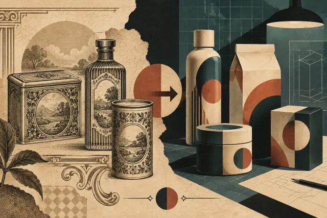
An ornate label, muted colours and a surface that looks worn can suggest a long tradition. But that impression does not make the package an antique or prove that the brand has been around for decades. Neo-retro is a contemporary aesthetic: it selects visual signs from different periods and combines them to make a present-day product feel familiar, crafted or authentic.
A 2020 study by Franck Celhay, Lise Magnier and Jan Schoormans, published in the International Journal of Design, examines how this style is constructed in packaging. The authors distinguish neo-retro from a reference to one specific historical style. “Retro” may point to a defined form from the past, whereas neo-retro mixes and reinterprets codes from different moments in design history. Its effect depends on the recognition of those cues, not on faithfully reproducing a particular period.
Typography, colour, texture and composition
To describe the style, the researchers examined the structural, graphic and informational elements of packages that designers had classified as retro. They also considered the overall impression of each composition. Among the recurring devices were limited palettes and muted colours, centred layouts and combinations of typefaces from different families. Lettering may curve or sit inside seals, ribbons and emblems; illustrations, patterns and ornament add visual richness.
Surfaces contribute to the evocation too. Textured papers, matte finishes and irregularities—real or simulated—can recall older materials and manual printing techniques. In illustrations, rough strokes or engraving effects can suggest handwork even when the image was produced digitally. Design can therefore refer to historical forms while using contemporary means to create the appearance of a manual process.
The packages in the study also included claims such as “handmade”, “local” or references to a founding date. The article notes that some recently established brands use formulas such as “since” followed by a year. In that context, the date may function as part of the visual code; by itself, it does not prove a long history. Aesthetic cues and printed information may reinforce one another, but neither is the same as independent evidence about a company’s past.
The authors describe the overall effect through three qualities: naturalness, harmony and elaborateness. Texture, organic materials and figurative illustrations can create a natural impression; a restricted palette and balanced composition contribute to harmony; an abundance of typefaces, ornaments and text adds elaborateness. This is not a formula every package must follow. What each device communicates depends on how it is combined and on the product it presents.
The associations the style evokes
For the second part of the research, the authors designed eight coffee packages that varied in ornamentation, texture and typographic variety. The study involved 251 participants recruited from among students. They assessed whether the designs looked retro and completed a free-association task. Packages with more neo-retro devices were perceived as more retro, and responses linked them to ideas such as authenticity, craftsmanship, originality and small-scale production. Texture was especially associated with an impression of environmental friendliness; typographic variation could suggest classicism or elegance.
These results concern associations prompted by specific designs, not verified properties of the products. A surface that looks like handmade paper may be an industrial finish with a printed texture; a date may be decorative; and the appearance of small-scale production does not, by itself, explain how the contents are made. Design invites viewers to infer values from visible cues. Recognising the difference between impression and evidence makes it possible to appreciate graphic work without treating evocation as proof.
The study also connects the style with values the authors associate with hipster subculture. In the experiment, certain combinations of neo-retro elements prompted that association as well. However, the article notes that the style now circulates more widely and does not belong exclusively to that group. The connection helps place some of its references—such as the appreciation of craft and authenticity—in a cultural context, but it does not make every neo-retro package an expression of subcultural identity.
The quantitative test had a specific scope: it involved students and coffee packages created for the research. Its results show how that group responded to those stimuli; they do not establish that people of other ages, cultures or product categories will react in the same way. The authors propose extending the research to other audiences and products.
Reinterpretation, not an artefact
A historical package belongs to the material, technical and commercial conditions of its own time. Neo-retro design, by contrast, selects some of its signs and turns them into a contemporary language: a centred composition or ornamental type may be combined with current techniques and a new brand identity. The distance between past and present is not erased; it is what allows the design to work as a quotation.
When looking at a neo-retro package, it is therefore useful to ask not only which decade it recalls, but which elements it borrows, how it transforms them and what values it suggests. It also matters whether those values are offered as an atmosphere—a sense of tradition or handwork—or as verifiable claims about the product. The past serves as a visual repertoire; what we see is a contemporary reinterpretation.
- Decade
- Contemporary
- Region
- Global
- Level
- Enthusiast
- Entities
- International Journal of Design
Sources and references
- Modelo multidimensional de los factores que afectan la interacción entre marketing y ventas en el lanzamiento de nuevos productos en Latino Américadoi.org · 2026-10-26
- Identidad de marca en la década de 2010: Microsoftopenalex.org · 2026-10-26
- Moderno y auténtico. Definiendo el estilo neorretro en ...translate.google.com · 2026-10-26
- La nostalgia como estrategia de venta. | AMVOblog.amvo.org.mx · 2026-10-26
- Marketing de nostalgia: ejemplos, claves y cómo aplicarlowww.ceupe.com · 2026-10-26