Evoking the past is not the same as having a history
Neo-retro style uses graphic devices associated with earlier periods on contemporary products. It can give a newly founded brand a retrospective appearance without reviving a specific historical design or continuing the story of an older company. The distinction between quoting the past and possessing genuine heritage is crucial: a package’s appearance does not, by itself, establish a brand’s age or provenance.
Franck Celhay, Lise Magnier and Jan Schoormans examined this aesthetic in packaging design in a 2020 article in the International Journal of Design. They describe neo-retro as a contemporary style that combines and reinterprets elements from different moments in design history rather than reproducing one historical movement. They link it to an aesthetic associated with hipster subculture, while noting that its use extended well beyond that group.
A vocabulary of materials and forms
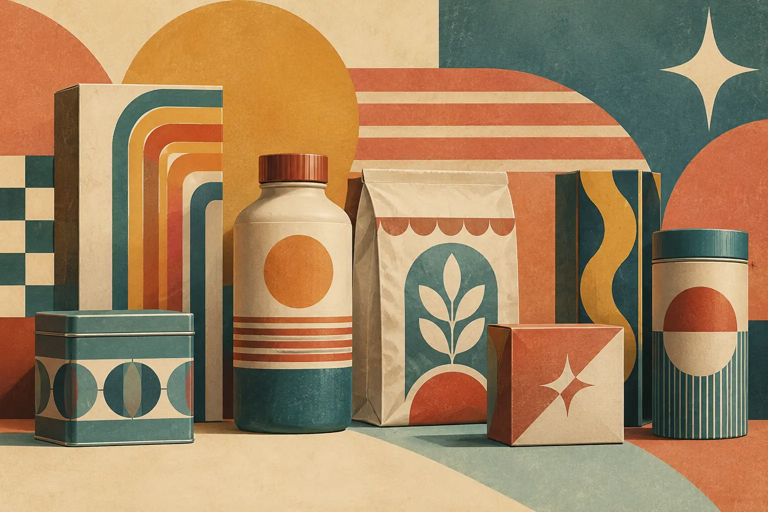
The study groups packaging features into structural, graphic and informational elements. At the material level, it identifies a preference for surfaces that suggest texture or naturalness—such as paper, cardboard and glass—over smooth, glossy finishes. Graphic devices include limited, muted palettes; mixed typefaces; text arranged in arches or badges; illustrations that imitate craft-printing techniques; and ornaments, patterns and simulated imperfections.
Composition matters too. The packages examined often combine several typefaces and styles, centre their text, and use decorative details that recall different historical graphic languages. Illustrations may look hand-drawn or traditionally printed even when produced digitally. Graphic textures and irregular edges imitate marks of printmaking and help create an impression of manual work.
The study describes the overall effect through three qualities: naturalness, harmony and elaborateness. Textured materials and apparent irregularities may suggest naturalness; a balanced composition and restricted palette, harmony; and a build-up of typefaces, ornaments and text, complexity. No single feature automatically makes packaging neo-retro: the impression depends on how the elements work together.
Printed words are part of the same visual grammar. References to local or handmade production, small batches and founding dates can reinforce a retrospective look. But a date or a handmade claim is not, on its own, proof of a long history or a particular production process. Appearance is a design choice; claims about a product or company require evidence of their own.
The associations examined in the study
To explore consumer responses, the researchers created eight coffee-package designs and varied three features: ornament, texture and typeface variation. The study involved 251 students aged 18 to 43. They rated whether the packages looked retro and completed a free-association task. Overall, designs with more neo-retro features tended to be perceived as more retrospective.
Responses linked those designs with ideas such as authenticity, craftsmanship, originality and small businesses. Texture was especially associated with an impression of environmental friendliness, while varied typefaces evoked the classic and elegant. These are associations prompted by experimental designs, not checks on how a product was made or on a brand’s age and actual practices.
The authors note that the quantitative study used a student sample and a single product category: coffee. Its findings therefore do not establish that other audiences would respond in the same way to packaging in other categories. They also distinguish between communicating an impression and substantiating a characteristic: a package can suggest craftsmanship without demonstrating that the product was made by hand.
Visual quotations, open meanings
Neo-retro gives designers and brands a way to express values through visual references to the past. Its meaning emerges from the combination of materials, typography, colour, texture and text, but it is not guaranteed: audiences may interpret a design differently from its creator’s intention. Nor must the style express nostalgia for a lived experience; it can combine references from different periods into a new image.
A careful reading separates two layers: which historical codes the design reuses, and what specific claims the package makes about the product or brand. The first is visual reinterpretation; the second must stand on its own facts. Neo-retro is not a recovered relic but a contemporary aesthetic that turns the past into a graphic language.
- Decade
- Contemporary
- Region
- Global
- Level
- Introduction
- Entities
- International Journal of Design, Franck Celhay
Sources and references 5
- Modelo multidimensional de los factores que afectan la interacción entre marketing y ventas en el lanzamiento de nuevos productos en Latino Américadoi.org · 2026-11-15
- Moderno y auténtico. Definiendo el estilo neorretro en ...translate.google.com · 2026-11-15
- Nintendoes.wikipedia.org · 2026-11-15
- Ponges.wikipedia.org · 2026-11-15
- 32Xes.wikipedia.org · 2026-11-15