A past designed in the present
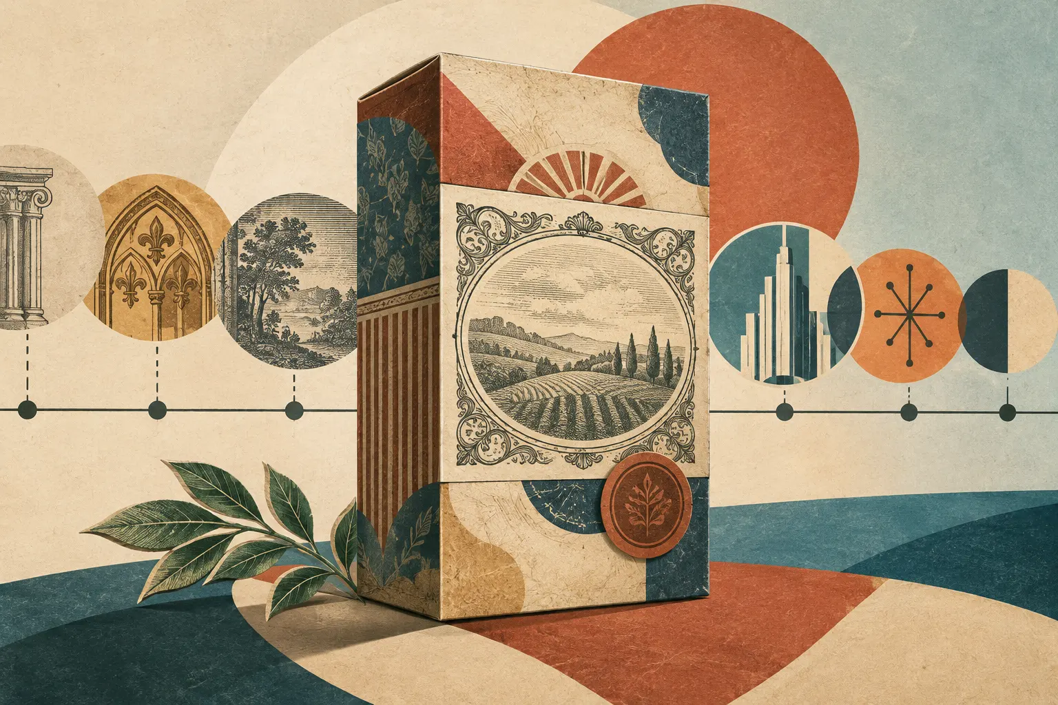
Neo-retro is neither the untouched revival of a historical style nor proof that a brand is old. It is a contemporary visual language that combines references from different periods to create an impression of the past. On packaging, that impression may come from matte or textured papers, muted colours, centred layouts, ornament and illustrations that recall handmade techniques.
A 2020 study by Franck Celhay, Lise Magnier and Jan Schoormans, published in the International Journal of Design, examines this style specifically in package design. The authors describe a repertoire that does not belong to a single period: it may bring together elements associated with Victorian graphics, Arts and Crafts, Art Nouveau or Art Deco. Mixing and reinterpretation are central; the aim is not to reproduce a historical visual identity faithfully.
The devices that create a retro effect
The analysis groups design features into structural, graphic and informational elements. Materials include paper, cardboard and glass, as well as non-glossy surfaces and textures that suggest irregularity. Common graphic devices include limited, muted palettes, centred compositions, frames, ribbons, patterns and ornaments. Illustrations may imitate engraving or hand drawing, while printed effects simulate wear and imperfection.
Typography follows no single formula. Serif, sans-serif and script lettering may be mixed, with text curved or set inside badges. This variety, combined with ornament and texture, contributes to an impression of complexity. The style can also rely on the package’s wording: claims such as “handmade” or “locally produced”, references to small batches, or a founding year.
Dates deserve particular attention. The study notes that some recently established brands use formulas such as “since” followed by a year despite having a short history. A date can work as a graphic and narrative device, but it does not, on its own, establish longevity. Likewise, an illustration that looks handmade does not show how the product was made—or how the image itself was produced.
What the design suggests—and what it cannot prove
Neo-retro packaging is often associated with authenticity, craftsmanship and naturalness. These are perceptions the design may evoke, not verified product qualities or guarantees about manufacturing methods. In an experiment with coffee packages, participants linked designs containing more neo-retro elements with ideas such as authenticity, craftsmanship and small brands. Texture was especially associated with perceived environmental friendliness; typographic variation strengthened the retro impression and, in some designs, associations with the classic or elegant.
The scope of these findings is specific: the research examined responses to particular designs. It does not show that such impressions lead to purchases or reflect companies’ actual practices. A surface that looks worn can evoke a history without documenting one; a claim about artisanal production may be part of the visual story, but the label’s appearance does not verify it.
An aesthetic that spread beyond its subculture
The article connects neo-retro’s rise with values associated with hipster subculture, including appreciation for vintage goods, artisanal production and authenticity. It also notes that these codes spread far beyond that group. The authors therefore use “neo-retro” for a broader contemporary style, not an aesthetic exclusive to one subculture.
The difference between an old object and a contemporary reinterpretation lies in their relationship to time. A historical package belongs to a particular context of production, trade and communication. A neo-retro package is designed in the present and may combine signs from different periods to evoke a general idea of tradition. Its appearance does not make it a period artefact or document business continuity.
Reading the design closely means asking which references are quoted, how they are combined and what values the result communicates. Neo-retro can create a persuasive sense of tradition without possessing one. That distance does not make the design less interesting; it shows how the present turns images of the past into tools for brand identity and persuasion.
- Decade
- Contemporary
- Region
- Global
- Level
- Introduction
- Entities
- International Journal of Design, Franck Celhay
Sources and references 5
- Modelo multidimensional de los factores que afectan la interacción entre marketing y ventas en el lanzamiento de nuevos productos en Latino Américadoi.org · 2026-11-14
- Estudio de los factores de compra de productos retro y segmentación del mercado potencial retroopenalex.org · 2026-11-14
- Periodismo contemporáneo de rock en La Plataopenalex.org · 2026-11-14
- Diseño de información gerencial para la toma de decisiones generada a partir de un caso Framework de auditoría interna. El caso de una empresa del rubro de salud.openalex.org · 2026-11-14
- Moderno y auténtico. Definiendo el estilo neorretro en ...translate.google.com · 2026-11-14