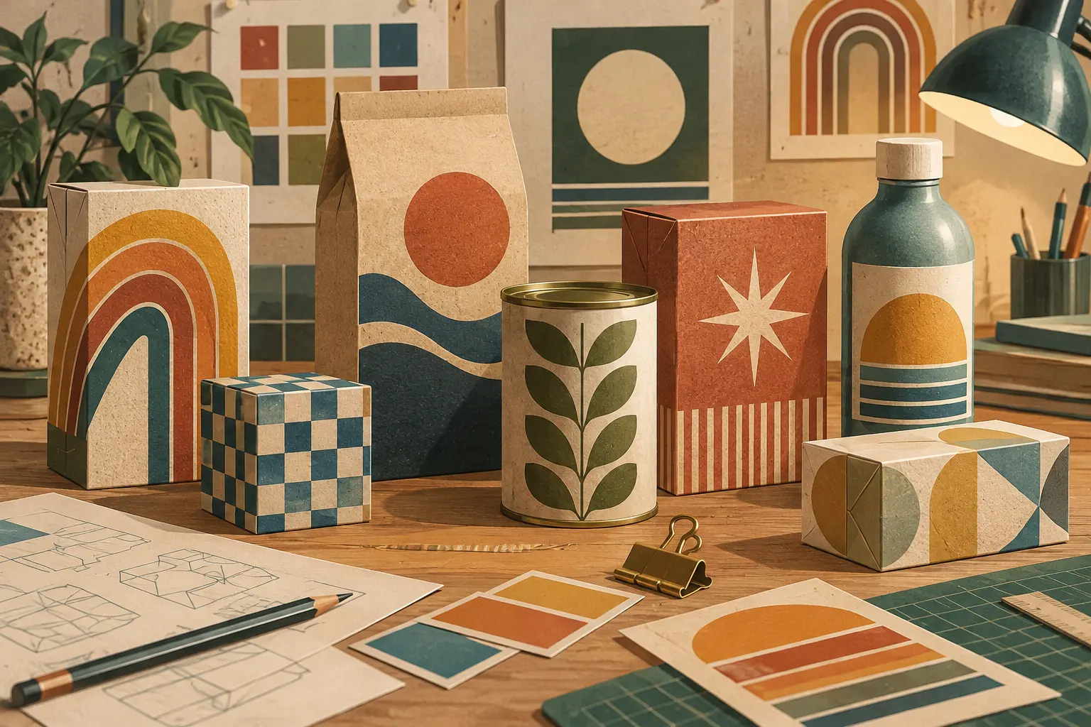
A contemporary aesthetic that quotes the past
Neo-retro is neither a recovered antique nor a faithful reproduction of a historical style. It is a contemporary visual language that combines references from different periods to suggest a connection with the past. On packaging, that suggestion can communicate naturalness, care, craftsmanship, tradition or familiarity. But appearance alone does not prove that a product is old, handmade or made by a brand with a long history.
A 2020 study by Franck Celhay, Lise Magnier and Jan Schoormans, published in the International Journal of Design, examines the elements that define this style in package design and the associations they evoke. The authors link it in part to hipster subculture aesthetics, while noting that its codes are used well beyond that context. A new brand, then, can adopt visual signs of tradition without having a historical continuity to support them.
How the retro effect is made
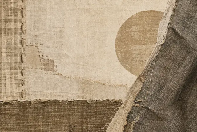
The study groups the design cues into structural, graphic and informational elements. Among the structural features are textured surfaces, matte finishes and visual references to materials such as paper, cardboard or glass. Imperfections matter too: they may belong to the material itself or be added graphically to imitate wear and hand printing.
The palette is often limited and muted, with hues that suggest natural or faded colours. Rather than relying on a single typeface, designs may combine serif, script and other styles. Text can be centred, arched or placed inside ribbons and badges. Engraving-like illustrations, ornaments, patterns and shadows add detail; phrases such as “handmade”, “locally produced” or “since” a particular year can reinforce the impression of tradition.
The authors also describe the style holistically through three qualities: naturalness, harmony and elaborateness. Textures and irregularities can make a package feel organic; centred composition and a restrained palette can create balance; and a wealth of decoration, typefaces and text can suggest complexity. No single cue has to stand alone or is always sufficient: in the experiment, combinations of several elements strengthened the retro perception.
What the visual cues suggest
To explore consumer responses, the researchers compared eight coffee-package designs that varied in texture, ornament and typeface variation. A total of 251 people aged 18 to 43 rated how retro each package looked and described the associations that came to mind.
Designs with more neo-retro elements were perceived as more retro. Associations included authenticity, craftsmanship, originality and small-scale production, as well as “hipster”. Texture was especially linked to eco-friendliness; typeface variation was also associated with the classic and elegant. Ornaments alone produced less distinct associations, though they contributed to the effect when combined with other cues.
The findings help explain the visual language’s effectiveness: familiar signs can quickly build a legible story around a product. They also reveal a tension. Design can communicate authenticity without proving it. A founding date printed on a package, for example, is a graphic device; whether it is true depends on the company’s history, not on the badge or typeface around it.
Evoking is not substantiating
Neo-retro reuses tactile-looking materials, muted colours, hand-drawn-looking illustrations and ornamental type, but reorganizes them with contemporary tools and aims. Quoting these features does not imply material continuity with packaging from earlier periods, nor does it reveal how a product is made. An aesthetic can suggest a history; a brand’s record and practices are separate matters.
The experiment focused on coffee packaging and used a student sample, so its findings describe how those participants responded to those designs. They do not establish that every audience or product category will react in the same way. Even so, the study offers a concrete account of how neo-retro works: familiar visual codes become associations of tradition, craft and authenticity. When reading a package, it is worth separating what its design evokes from what the brand can substantiate.
- Decade
- Contemporary
- Region
- Global
- Level
- Introduction
- Entities
- No linked entities
Sources and references
- Identidad de marca en la década de 2010: Microsoftopenalex.org · 2026-10-25
- Manual para la internacionalización de la marca de ropa urbana Guiri para su participación en la feria Colombia-Moda en Medellín Colombiaopenalex.org · 2026-10-25
- Design, development and manufacture of surface dry for leather (crosta) and proposed design and manufacture of a product line in the form of leather business in business practice pieles duarte.openalex.org · 2026-10-25
- Moderno y auténtico. Definiendo el estilo neorretro en ...translate.google.com · 2026-10-25
- La nostalgia como estrategia de venta. | AMVOblog.amvo.org.mx · 2026-10-25