Quoting the past is not recovering an original
A label can look old without ever having existed in another era. That distinction lies at the heart of neo-retro: a contemporary style that selects and combines visual codes from different pasts. It is not necessarily a historical reproduction, nor does it by itself prove that a brand has a long history. Its interest lies in how design features—a textured surface, an ornamental typeface or a prominent date—can be read as signs of craft and authenticity.
Franck Celhay, Lise Magnier and Jan Schoormans describe neo-retro in packaging as a combination of structural, graphic and informational elements. They distinguish it both from reviving a brand’s own visual heritage and from reproducing a specific historical style: neo-retro can bring references from different periods together in a contemporary composition.
A layered visual vocabulary
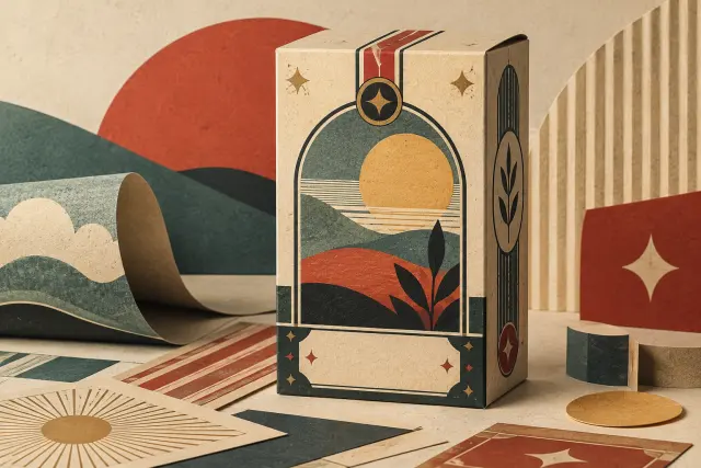
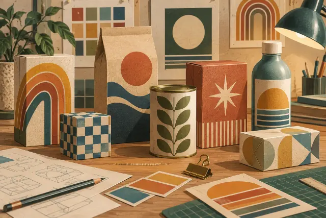
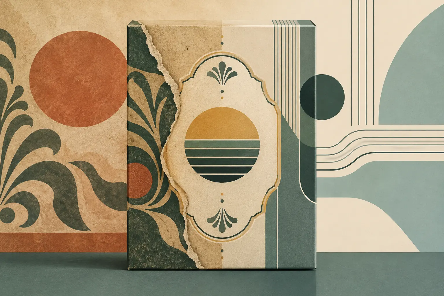
The packages analysed by the researchers include materials that suggest touch and use, such as matte or uncoated paper, cardboard and textured surfaces. Their palettes tend towards muted or nature-inspired colours, often in a limited range. Typography may mix type families, combine serif and sans-serif lettering, or curve text into arches, badges and banners. Illustrations reminiscent of engraving, ornaments, patterns and simulated printing imperfections also contribute to the look.
Printed words reinforce that reading. References to handmade production, local sourcing or small batches, as well as formulas such as “since” followed by a year, suggest tradition. Some relatively recent brands in the examples studied used dates of this kind. The graphic device alone, then, cannot establish historical continuity: it is part of the visual language and story proposed by the package.
Nor does the effect depend on a checklist of isolated elements. The research considers the overall impression through three dimensions: naturalness, harmony and elaborateness. Textures and organic forms can suggest naturalness; a centred composition and limited palette can create balance; an accumulation of typefaces, ornaments and text can make a design feel complex. Together, these features make the past a design repertoire, not the package an antique object.
The associations the style evokes
In the second part of the study, 251 participants evaluated coffee-package designs created for the experiment. Designs containing more neo-retro elements tended to be perceived as more retro. Free-word responses included associations with authenticity, craftsmanship, originality and small scale. Textured surfaces were particularly linked to environmental friendliness, while varied typography evoked the classic and elegant.
The results concern particular designs and a sample of Dutch students; they do not establish a universal rule for every product or audience. They do, however, help explain how the style works: packaging does more than describe its contents. It also offers visual cues from which viewers infer how a product is made or what kind of brand sells it. The authors caution that these associations neither demonstrate that someone will buy the product nor certify the truth of the story it evokes.
The reference and its reinterpretation
To read a neo-retro design, it helps to separate two questions: what does it retain from the visual language it quotes, and what does it transform? It may preserve a limited palette, a centred layout or recognisable typographic devices; it may also combine references from different periods, simulate print marks digitally or highlight a date without the product coming from a century-old company.
Material and context matter as much as graphics. Contemporary textured paper is not the same as an aged original wrapper. A digital illustration that imitates engraving does not necessarily share the process of historical craft printing. Recognising these differences makes the design easier to read: it shows how the present uses the past as a repertoire and what values it seeks to communicate.
Neo-retro can evoke authenticity, but evoking it is not the same as proving it. Its defining tension lies there: signs recognised from other eras are put to work in a contemporary package.
- Decade
- Contemporary
- Region
- Global
- Level
- Enthusiast
- Entities
- No linked entities
Sources and references
- Identidad de marca en la década de 2010: Microsoftopenalex.org · 2026-10-25
- Manual para la internacionalización de la marca de ropa urbana Guiri para su participación en la feria Colombia-Moda en Medellín Colombiaopenalex.org · 2026-10-25
- Design, development and manufacture of surface dry for leather (crosta) and proposed design and manufacture of a product line in the form of leather business in business practice pieles duarte.openalex.org · 2026-10-25
- Moderno y auténtico. Definiendo el estilo neorretro en ...translate.google.com · 2026-10-25
- Marketing de nostalgia: ejemplos, claves y cómo aplicarlowww.ceupe.com · 2026-10-25