An old-looking package is not, for that reason, an old object. In contemporary design, neo-retro combines references to styles from different periods to give present-day products an evocative appearance. The distinction is between a brand’s actual history and the history its design suggests: graphic forms can communicate tradition, craft or age without a corresponding legacy.
A contemporary style drawing on several pasts
Franck Celhay, Lise Magnier and Jan Schoormans define neo-retro as a contemporary style that quotes and reinterprets elements from different moments in design history. It does not necessarily revive a brand’s historical identity. New brands with no direct connection to the past they evoke use it too. In this sense, the prefix “neo” marks a creation of the present, not an object preserved from another era.
The authors connect the rise of this visual language to a cultural context associated with the hipster subculture and its appreciation of vintage goods, artisanal production and authenticity. They also note that the style spread beyond that group. Neo-retro, then, describes a widely circulating visual repertoire rather than an aesthetic exclusive to one community.
The devices that create the look
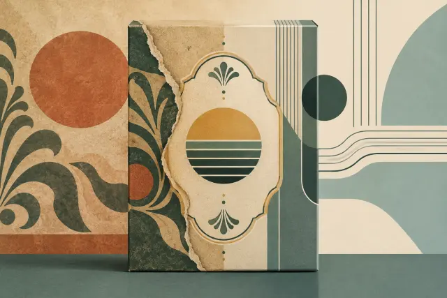
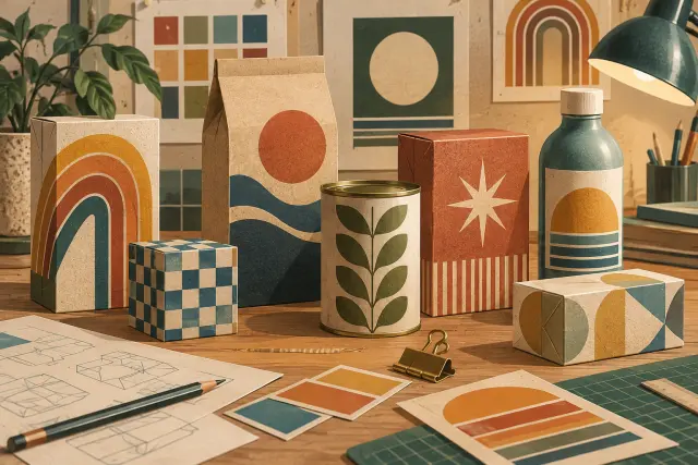
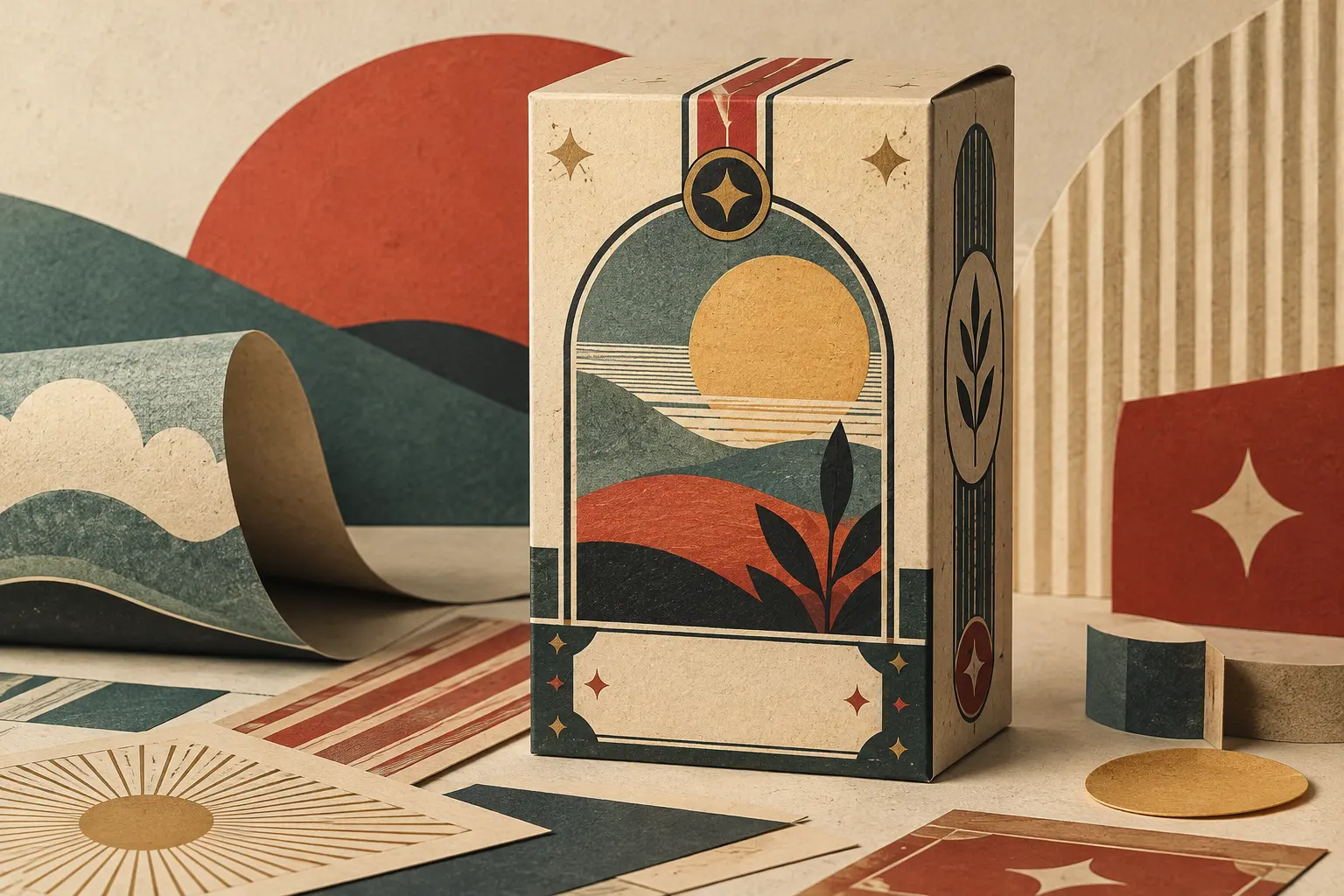
The study groups neo-retro features into structural, graphic and informational elements. Structural features include textured or natural-looking materials—such as paper and cardboard—instead of glossy, smooth surfaces. Graphic features include limited, muted palettes; combinations of typeface families; curved or framed text; ornaments and patterns; and illustrations that imitate hand-printing techniques. Claims such as “handmade” or “locally produced,” as well as an establishment date, may also appear.
These devices are not documentary evidence of age. A printed date can be part of the visual code, but the study notes that relatively recent brands also use formulas such as “since” or “established in.” Similarly, a digitally generated texture can suggest wear or manual work. The effect depends on how the elements are combined and how viewers interpret the package as a whole.
The researchers describe that overall impression through three qualities: naturalness, harmony and elaborateness. Naturalness may come from organic materials, textures and figurative illustrations; harmony from a centred composition and restricted colour range; elaborateness from the accumulation of typefaces, ornaments, patterns and text. These are not requirements for every package, but dimensions for describing the style.
The associations design can evoke
In the second part of the research, 251 participants evaluated coffee-package designs that varied in their use of ornaments, texture and typeface variation. Designs with more neo-retro elements tended to be perceived as more retro. Associations included authenticity, craftsmanship, originality and small scale. Texture was particularly associated with eco-friendliness, while varied typefaces evoked the classic and elegant.
These results describe responses to experimental designs; they do not certify a company’s practices or prove that a product is artisanal, sustainable or old. An aesthetic can make such qualities seem plausible, but verifying them requires independent information about the product and how it is made. The distinction prevents visual nostalgia from being mistaken for an authentic brand history.
The research has a specific scope: it examines packaging design and uses coffee as its product category; the quantitative test used a student sample. Its findings are therefore not a universal rule about consumers, countries or sectors. Its contribution is a vocabulary for recognising how packaging quotes the past and distinguishing that strategy from the actual history of an object or brand.
Neo-retro does not necessarily reproduce a single historical model. It mixes and reinterprets cues from different design traditions to create a contemporary impression of familiarity, craft or authenticity. Looking closely at a package makes it possible to see that process: which features of the past it invokes, how it combines them and what ideas it aims to suggest, without confusing the representation with its historical reference.
- Decade
- Contemporary
- Region
- Global
- Level
- Introduction
- Entities
- No linked entities
Sources and references
- Identidad de marca en la década de 2010: Microsoftopenalex.org · 2026-10-25
- Manual para la internacionalización de la marca de ropa urbana Guiri para su participación en la feria Colombia-Moda en Medellín Colombiaopenalex.org · 2026-10-25
- Design, development and manufacture of surface dry for leather (crosta) and proposed design and manufacture of a product line in the form of leather business in business practice pieles duarte.openalex.org · 2026-10-25
- Moderno y auténtico. Definiendo el estilo neorretro en ...translate.google.com · 2026-10-25
- Nintendoes.wikipedia.org · 2026-10-25