An advertisement may catch the eye through its colour, typography or a memorable image. But describing its appearance does not explain how it works. To approach its design decisions, ask what information stands out, what visual route it proposes, and what tasks it assigns to text and image. These are questions about organization and use, not an invitation to guess what its creator had in mind.
The available evidence lets us test this way of looking at two scales: the preservation of advertising and graphic materials, and a study of an Argentine magazine published from 1970 to 1974. It also imposes a limit: the supplied records contain neither detailed reproductions of advertisements nor analyses of specific pieces. What follows is therefore a method of reading, not a reconstruction of particular intentions.
Separate function from appearance
A composition may seem modern, restrained or striking; these words describe impressions, not functional decisions. To go further, observe what the design enables: finding a headline, distinguishing one offer from other information, identifying a brand or following a sequence. Each specific claim requires examining the original piece. Without it, we can ask analytical questions, but cannot assign it a definite function.
A general description of graphic design presents it as visual communication that combines text and images to convey messages to social groups. This is a useful starting point, but it does not explain how a particular advertisement fulfils its purpose. The principle that form follows function can be a critical question, not an automatic explanation: first identify the function the piece appears to propose, then check whether its composition makes that function legible.
The archive changes what we can see
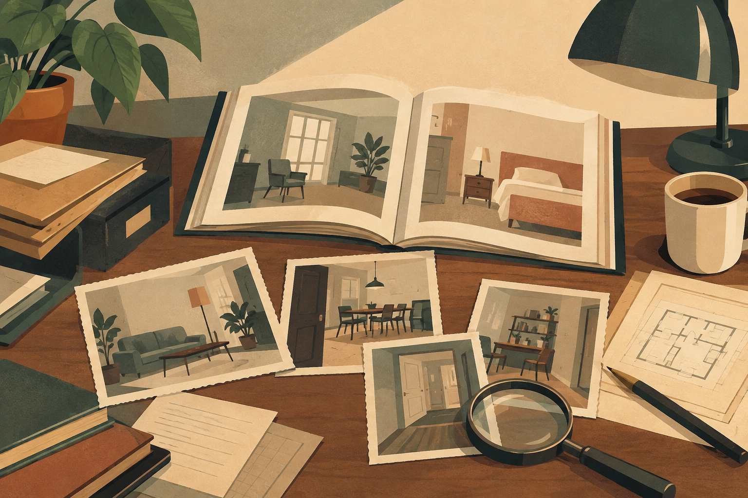
An archive is not a transparent window onto the past. A preserved and exhibited collection determines which pieces are available for consultation, how they are described and what context accompanies them. The summary of the study on MUVAP says its exhibitions document the history of Spanish advertising and graphic design in Spain. This documentation makes materials available for study, while reminding us that an exhibition is also a selection and an arrangement of evidence.
The practical consequence is to distinguish what a preserved object shows from what an archive lets us claim about its circulation or reception. An archived image may give access to its composition; by itself, it cannot establish how many people saw it, how they interpreted it or what commercial result it produced. If the sources do not provide those facts, visual intuition should not be used to fill the gaps.
A magazine as a field of questions
The record of a study on the Argentine magazine Ciencia Nueva identifies a specific period, 1970–1974, and announces an analysis of content, graphic resources, advertising and audiences. Its scope invites a reading that connects design with editorial context: how did graphic resources relate to content? What place did advertising occupy in the magazine? What is known about its audiences, and what remains undocumented?
The available record does not include the article’s findings or reproduce pages from the magazine. It therefore cannot establish which visual solutions the publication used, how its advertisements were arranged or what effect they had. The record helps locate a case study and identify the dimensions its authors investigate; it is not enough to describe findings that the supplied material does not show.
Hierarchy, sequence and reading
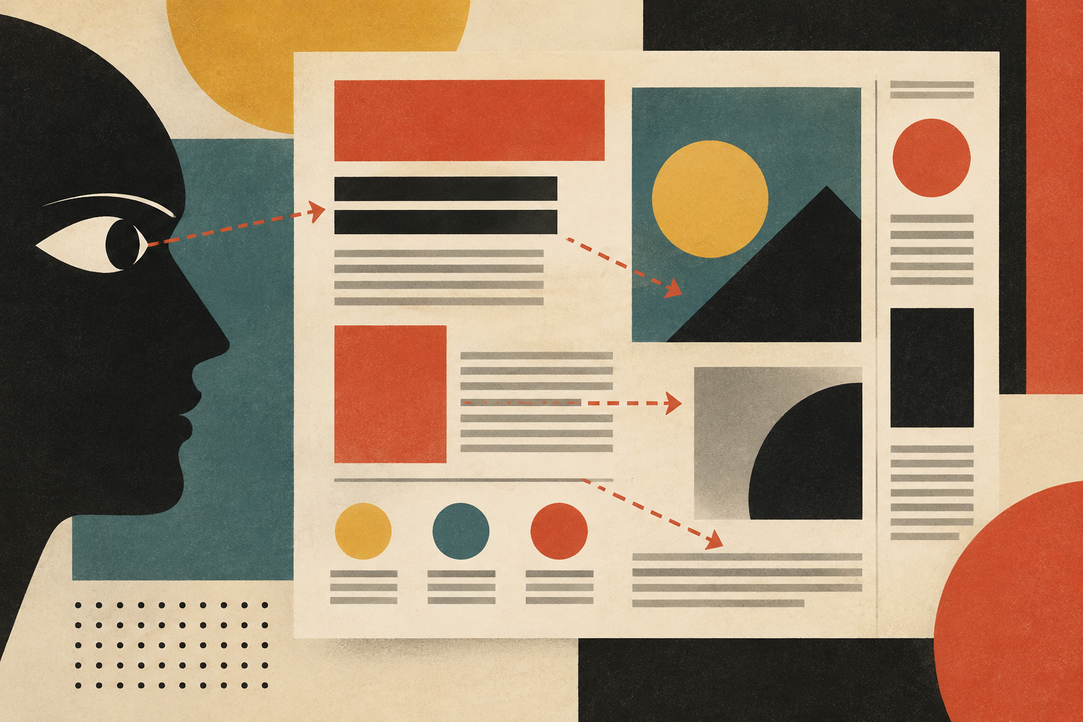
A careful examination begins with visible elements: text, images, relative size, position and grouping. Then ask how those relationships establish hierarchy. What is noticed first? Which information depends on reading something else beforehand? Does an image add information, create an association or simply attract attention? Without an adequate reproduction, these questions must remain open.
Advertising aims to communicate and persuade, but that function does not make other questions irrelevant. The material on criticism of advertising gathers objections concerning saturation, psychological pressure, privacy and social or environmental consequences. That critique does not prove that a specific piece causes a specific effect. It does help prevent design analysis from stopping at persuasive effectiveness: we can also ask what kind of attention a piece demands, whom it addresses and what costs or tensions fall outside the frame.
What comparison can—and cannot—do
Comparing pieces can distinguish functional decisions from aesthetic labels, provided that the comparison uses identifiable objects and clear criteria. The Centro Cultural MVA’s exhibition of graphic-design milestones, for instance, is described as a selection of works that shaped the discipline. That description tells us about the exhibition’s premise; without its catalogue or the works themselves, it cannot support a comparative assessment of their solutions.
A useful comparison would explain which elements perform similar functions and which respond to different contexts. Calling two designs “classic” or “modern” is not enough. Nor should a difference in style be turned into a difference in use without evidence: colour may attract, encode or decorate, but assigning it any of those roles requires examining the piece and, where possible, consulting related documentation.
Limits are part of a better reading
The gathered materials point to a history that can be approached through archives, studies of publications and exhibitions. An overview of changes in design and an exhibition of milestones offer general context; research records on advertising and graphic resources set out more specific questions. They do not all have the same scope, and a summary or bibliographic record cannot replace consulting the full text or the object under study.
The strongest reading distinguishes three levels: what is visible in the piece, what a source documents about its context, and what the analysis interprets. Here, the available sources support the importance of studying design as an organization of communication and treating the archive as a mediator. They are not enough to assign intentions, results or features to specific advertisements. That boundary does not weaken the analysis: it prevents an impression from masquerading as fact and makes clear what evidence would be needed to go further.
- Decade
- 1970s
- Region
- Latin America
- Level
- Enthusiast
- Entities
- MUVAP
Sources and references
- LA REVISTA ARGENTINA CIENCIA NUEVA (1970-1974): ANÁLISIS DE CONTENIDOS, RECURSOS GRÁFICOS, PUBLICIDAD Y PÚBLICOSopenalex.org · 2026-10-04
- MUVAP (2001- 2016): museo virtual que documenta la ...revistas.ucm.es · 2026-10-04
- Un Recorrido Por La Historia Del Diseño Y Sus Cambiossirope.es · 2026-10-04
- Hitos del diseño gráfico internacional. 1890 - hoy: Breve ...www.centroculturalmva.es · 2026-10-04
- Diseño gráficoes.wikipedia.org · 2026-10-04
- Crítica a la publicidades.wikipedia.org · 2026-10-04