An old-fashioned look, made in the present
Packaging can look old without ever having been old. Neo-retro design takes forms and graphic devices associated with different periods and reinterprets them for contemporary products and brands. It is not necessarily the revival of a historical package, nor proof that a company has a long history: the past may exist only as a visual reference.
In a study published in 2020 in the International Journal of Design, Franck Celhay, Lise Magnier and Jan Schoormans examine how this aesthetic is constructed in packaging and what it may communicate. Their research combines analysis of graphic elements with perception tests: first, it describes features designers identified as neo-retro; then it explores the associations prompted by variations on a coffee package.
The distinction matters because appearance is not provenance. A design may suggest tradition, craftsmanship or authenticity; those impressions alone do not establish that a product is handmade or that its brand has historical roots.
From materials to lettering: a repertoire of cues
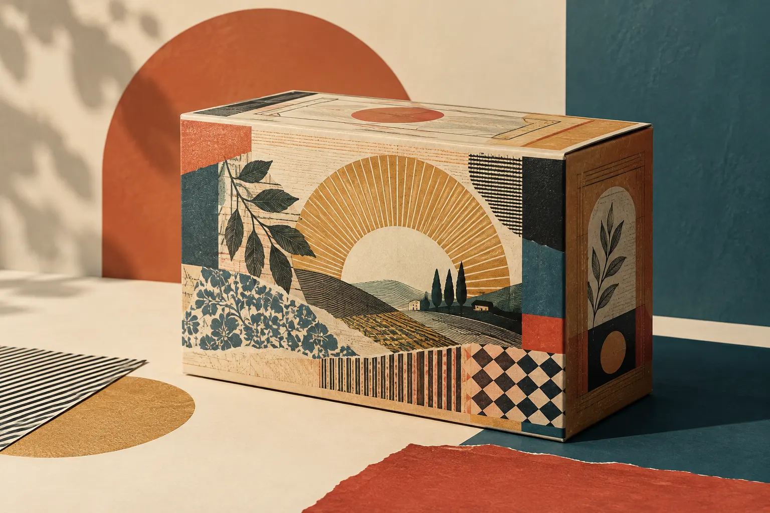
The authors organise neo-retro features into three groups: structural, graphic and informational elements. Structural features include materials and finishes that recall older packages, such as glass, uncoated paper and textured surfaces. Natural-looking materials and small irregularities can contribute to an impression of an object made with care, set against a smooth, glossy industrial surface.
Graphic elements include limited, often muted palettes; mixed typefaces; curved text, arches and lettering arranged in badges; ornaments, frames and patterns. Illustrations may imitate techniques such as engraving or hand printing. Designers also use simulated imperfections: ink that appears worn, irregular edges and textures added to digital images. Together, these devices give computer-generated graphics a less uniform finish.
The third group consists of words printed on the package. Phrases such as “handmade” or “since” followed by a year invoke craft and continuity. But these phrases are part of the product’s visual language: a printed date, without supporting information, does not establish when a brand began or how its contents were made.
Beyond classifying individual devices, the study describes the overall effect of these designs through three qualities: naturalness, harmony and elaborateness. Naturalness comes from materials, textures and images that evoke the organic. Harmony relates to symmetry, centred layouts and restrained palettes. Elaborateness, by contrast, comes from accumulated detail: varied typography, ornaments, frames and claims. This is not a fixed formula; the features can be combined in many ways.
What the perception tests suggest
For the second part of the study, the researchers tested eight coffee-package designs with 251 participants. They varied the presence of ornaments, textures and typeface variation. Overall, designs with more neo-retro features were more often perceived as retro. Each manipulated device contributed to that perception, though the associations they produced were not identical.
Participants’ responses included ideas of authenticity and craftsmanship. Textures were especially linked to eco-friendliness, while typeface variation also evoked classic and elegant qualities. Designs combining several features were more strongly associated with retro and hipster culture, according to the authors’ analysis.
The scope of these findings is specific: they describe associations prompted by the designs under study, not objective qualities of the products. A texture that suggests environmental responsibility does not prove that a package is sustainable. Nor does a label that conveys craftsmanship establish that the coffee was produced by hand. Design can communicate values without substantiating them.
The authors connect neo-retro with values associated with hipster subculture, including an interest in authenticity and artisanal production, while noting that these visual codes have spread beyond that group. They therefore use neo-retro for a contemporary aesthetic that quotes varied repertoires from the past and circulates in different commercial settings. The cultural connection helps explain the style; it does not make every ornamented package an emblem of a subcultural identity.
Quoting the past is not preserving it
A comparison between historical packaging and a contemporary reinterpretation can consider form, materials, printing techniques and production context. A printed texture that simulates wear is not aged paper; a typeface inspired by an old style does not turn a new product into a period object. The reference may be recognisable and effective, but the package still belongs to the time in which it was designed.
The difference between quotation and history makes it possible to see more clearly what a design borrows and what it changes. It may take up a centred composition or a limited palette while adapting its materials, graphic production and messaging for a contemporary brand. The past serves as a repertoire of signs: it supplies associations, not a demonstrated corporate history.
Celhay and his colleagues’ analysis offers a way to read those choices without confusing appearance with provenance. In neo-retro design, tradition appears as a visual language; its meaning depends on how the devices are combined and on what viewers recognise in them.
- Decade
- Contemporary
- Region
- Global
- Level
- Introduction
- Entities
- International Journal of Design, Franck Celhay
Sources and references 5
- Modelo multidimensional de los factores que afectan la interacción entre marketing y ventas en el lanzamiento de nuevos productos en Latino Américadoi.org · 2026-11-16
- Estudio de los factores de compra de productos retro y segmentación del mercado potencial retroopenalex.org · 2026-11-16
- Periodismo contemporáneo de rock en La Plataopenalex.org · 2026-11-16
- Moderno y auténtico. Definiendo el estilo neorretro en ...translate.google.com · 2026-11-16
- Marketing de nostalgia: ejemplos, claves y cómo aplicarlowww.ceupe.com · 2026-11-16